
https://www.kaggle.com/competitions/bike-sharing-demand
Bike Sharing Demand | Kaggle
www.kaggle.com
kaggle 연습용 대회인 Bike sharing demand.
따릉이와 같은 자전거 수요 예측을 하는 대회이다.
kaggle notebook으로 진행했다.
import numpy as np
import pandas as pd

# 데이터 경로
data_path = '/kaggle/input/bike-sharing-demand/'

train = pd.read_csv(data_path + 'train.csv') # train data
test = pd.read_csv(data_path + 'test.csv') # test data
submission = pd.read_csv(data_path + 'sampleSubmission.csv') # submission sample data

train.shape, test.shape
((10886, 12), (6493, 9))
train.head()

# datetime : 1시간 간격으로 기록한 일시
# season : 계절(1,2,3,4 -> 봄, 여름, 가을, 겨울)
# holiday : 공휴일 여부(1 -> 공휴일)
# workingday : 근무일 여부 (1 -> 근무일) => 주말과 공휴일이 아니면 근무일이라고 간주함
# weather : 1->맑음, 2-> 옅은안개or약간 흐림, 3->약간의 눈과 비, 천둥번개, 흐림 4-> 폭우와 천둥번개 ==> 숫자가 클수록 날씨가 안좋음
# temp : 실제온도
# atemp : 체감온도
# humidity : 상대습도
# casual : 비회원 수
# registered : 회원 수
# count :자전거 대여 수량

주석에도 달아두었지만 주어진 데이터들의 각 열의 정보는 다음과 같다.
# datetime : 1시간 간격으로 기록한 일시
# season : 계절(1,2,3,4 -> 봄, 여름, 가을, 겨울)
# holiday : 공휴일 여부(1 -> 공휴일)
# workingday : 근무일 여부 (1 -> 근무일) => 주말과 공휴일이 아니면 근무일이라고 간주함
# weather : 1->맑음, 2-> 옅은안개or약간 흐림, 3->약간의 눈과 비, 천둥번개, 흐림 4-> 폭우와 천둥번개 ==> 숫자가 클수록 날씨가 안좋음
# temp : 실제온도
# atemp : 체감온도
# humidity : 상대습도
# casual : 비회원 수
# registered : 회원 수
# count :자전거 대여 수량
train data를 보았으니 test data와 제출데이터는 어떻게 생겼는지 한번 보고 넘어가야 방향을 잡을 수 있다.
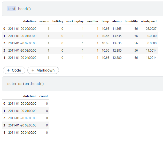
해당 날짜에 주어진 환경들을 토대로 얼마나 많은 양의 자전거 서비스가 이용이 될 지에 대한 예측 대회이다.

Null값 없이 깔끔한 데이터
Feature들을 핸들링 해보자
print(train['datetime'][100]) # datetime 100번째 원소
print(train['datetime'][100].split()) # 공백 기준으로 문자열 나누기
print(train['datetime'][100].split()[0]) # 날짜
print(train['datetime'][100].split()[1]) # 시간
2011-01-05 09:00:00
['2011-01-05', '09:00:00']
2011-01-05
09:00:00print(train['datetime'][100].split()[0]) # 날짜
print(train['datetime'][100].split()[0].split("-")) # "-" 기준으로 문자열 나누기
print(train['datetime'][100].split()[0].split("-")[0]) # 연도
print(train['datetime'][100].split()[0].split("-")[1]) # 월
print(train['datetime'][100].split()[0].split("-")[2]) # 일2011-01-05
['2011', '01', '05']
2011
01
05print(train['datetime'][100].split()[1]) # 시간
print(train['datetime'][100].split()[1].split(":")) # ":" 기준으로 문자열 나누기
print(train['datetime'][100].split()[1].split(":")[0]) # 시
print(train['datetime'][100].split()[1].split(":")[1]) # 분
print(train['datetime'][100].split()[1].split(":")[2]) # 초09:00:00
['09', '00', '00']
09
00
00
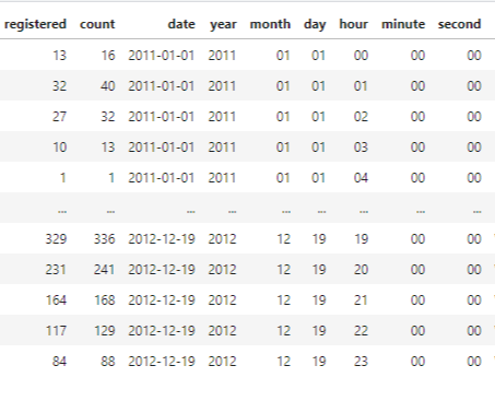
연, 월, 일, 시, 분, 초를 각각의 column들로 빼보자
train['date'] = train['datetime'].apply(lambda x:x.split()[0]) # 날짜 피처 생성

# 연, 월, 일, 시, 분, 초 피처 차례로 생성
train['year'] = train['datetime'].apply(lambda x:x.split()[0].split("-")[0])
train['month'] = train['datetime'].apply(lambda x:x.split()[0].split("-")[1])
train['day'] = train['datetime'].apply(lambda x:x.split()[0].split("-")[2])
train['hour'] = train['datetime'].apply(lambda x:x.split()[1].split(":")[0])
train['minute'] = train['datetime'].apply(lambda x:x.split()[1].split(":")[1])
train['second'] = train['datetime'].apply(lambda x:x.split()[1].split(":")[2])
날씨, 계절, 요일은 보기 쉽게 문자열로 변환해보자
from datetime import datetime
import calendar

print(train['date'][100]) # 임의의 날짜
print(datetime.strptime(train['date'][100], '%Y-%m-%d')) # datetime 타입으로 변경

# 정수로 요일 반환
print(datetime.strptime(train['date'][100], '%Y-%m-%d').weekday())

# 문자열로 요일 반환
print(calendar.day_name[datetime.strptime(train['date'][100], '%Y-%m-%d').weekday()])
2011-01-05
2011-01-05 00:00:00
2
Wednesday
train['weekday'] = train['date'].apply(lambda dateString:
                                      calendar.day_name[datetime.strptime(dateString, "%Y-%m-%d").weekday()])
train['season'] = train['season'].map({1: 'Spring',
2: 'Summer',
3: 'Fall',
4: 'Winter'})
train['weather'] = train['weather'].map({1: 'Clear',
2: 'Mist, Few clouds',
3: 'Light snow, Rain, Thunderstrom',
4: 'Heavy Rain, Thunderstorm, Snow, Fog'})train.head()
이쁘게 치환하여 완성했다.
이제 시각화를 통해 이 데이터들을 살펴보자
 import seaborn as sns
 import matplotlib as mpl
 import matplotlib.pyplot as plt
 %matplotlib inline
1. Distribution plot (분포도)
mpl.rc('font', size = 15) # 폰트 크기 15로 출력 셋팅
sns.displot(train['count']) # 분포도 출력
회귀 모델이 좋은 성능을 내려면 정규분포를 따라야한다고 한다.
이렇게 왼쪽 편향이 되어있을 때는 로그변환을 해주면 좋다.
sns.displot(np.log(train['count']))
2. Bar plot (막대 그래프)
# step1. (m x n) Figure 준비
mpl.rc('font', size = 14) # 폰트크기 설정
mpl.rc('axes', titlesize=15) # 각 축의 제목 크기 설정
figure, axes = plt.subplots(nrows=3, ncols=2) # 3행 2열 figure 생성
plt.tight_layout() # 그래프 사이에 여백 확보
figure.set_size_inches(10, 9) # 전체 Figure 크기를 10x9인치로 설정

# step2. 각 축에 서브플롯 할당
sns.barplot(x='year', y='count', data=train, ax=axes[0, 0])
sns.barplot(x='month', y='count', data=train, ax=axes[0, 1])
sns.barplot(x='day', y='count', data=train, ax=axes[1, 0])
sns.barplot(x='hour', y='count', data=train, ax=axes[1, 1])
sns.barplot(x='minute', y='count', data=train, ax=axes[2, 0])
sns.barplot(x='second', y='count', data=train, ax=axes[2, 1])

# step3. 세부설정
axes[0, 0].set(title='Rental amounts by year')
axes[0, 1].set(title='Rental amounts by month')
axes[1, 0].set(title='Rental amounts by day')
axes[1, 1].set(title='Rental amounts by hour')
axes[2, 0].set(title='Rental amounts by minute')
axes[2, 1].set(title='Rental amounts by second')
# 1행의 x축 라벨 2개를 90도 회전 (보기 편하도록)
axes[1, 0].tick_params(axis='x', labelrotation=90)
axes[1, 1].tick_params(axis='x', labelrotation=90)
3. Box plot(박스플롯)
# Step1. m행 n형 Figure 준비
figure, axes = plt.subplots(nrows=2, ncols=2) # 2행 2열
plt.tight_layout()
figure.set_size_inches(10, 10)

# Step2. 서브 플롯 할당
# 계절, 날씨, 공휴일, 근무일별 대여 수량 박스플롯
sns.boxplot(x='season', y='count', data=train, ax=axes[0, 0])
sns.boxplot(x='weather',y='count', data=train, ax=axes[0, 1])
sns.boxplot(x='holiday',y='count', data=train, ax=axes[1, 0])
sns.boxplot(x='workingday', y='count', data=train, ax=axes[1, 1])

# Step3. 세부 설정
axes[0, 0].set(title='Box Plot On Count Across Season')
axes[0, 1].set(title='Box Plot On Count Across Weather')
axes[1, 0].set(title='Box Plot On Count Across Holiday')
axes[1, 1].set(title='Box Plot On Count Across Workingday')

axes[0, 1].tick_params(axis='x', labelrotation=10)
4. Point plot(포인트 플롯)
# Step1. m행 n열 Figure 준비
mpl.rc('font', size=11)
figure, axes = plt.subplots(nrows=5) # 5행 1열
figure.set_size_inches(12, 18)

# Step2. 서브플롯 할당
# 근무일, 공휴일, 요일, 계절, 날씨에 따른 시간대별 평균 대여 수량 포인트플롯
sns.pointplot(x='hour', y='count', data=train, hue = 'workingday', ax=axes[0])
sns.pointplot(x='hour', y='count', data=train, hue = 'holiday', ax=axes[1])
sns.pointplot(x='hour', y='count', data=train, hue = 'weekday', ax=axes[2])
sns.pointplot(x='hour', y='count', data=train, hue = 'season', ax=axes[3])
sns.pointplot(x='hour', y='count', data=train, hue = 'weather', ax=axes[4])
5. Scatter plot graph with regression line (회귀선을 포함한 산점도 그래프)
# Step1. m행 n열 Figure 준비
mpl.rc('font', size=15)
figure, axes = plt.subplots(nrows=2, ncols=2)
plt.tight_layout()
figure.set_size_inches(7, 6)

# Step2. 서브플롯 할당
# 온도, 체감 온도, 풍속, 습도 별 대여 수량 산점도 그래프
sns.regplot(x='temp', y='count', data=train, ax=axes[0, 0],
           scatter_kws={'alpha':0.2}, line_kws={'color':'blue'})
sns.regplot(x='atemp', y='count', data=train, ax=axes[0, 1],
           scatter_kws={'alpha':0.2}, line_kws={'color':'blue'})
sns.regplot(x='windspeed', y='count', data=train, ax=axes[1, 0],
           scatter_kws={'alpha':0.2}, line_kws={'color':'blue'})
sns.regplot(x='humidity', y='count', data=train, ax=axes[1, 1],
           scatter_kws={'alpha':0.2}, line_kws={'color':'blue'})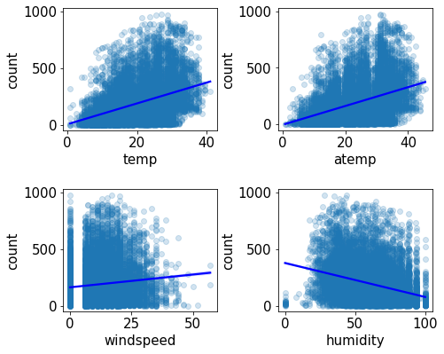
6. Heatmap (히트맵)
- 수치형 데이터간의 어떠한 상관관계가 있는지에 대해 알아봄
train[['temp','atemp','humidity','windspeed','count']].corr()
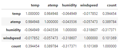
# Feature 간의 상관관계 매트릭스
corrMatrix = train[['temp','atemp','humidity','windspeed','count']].corr()
fig, ax = plt.subplots()
fig.set_size_inches(10, 10)
sns.heatmap(corrMatrix, annot=True) # 상관관계 히트맵 그리기
ax.set(title='Heatmap of Numerical Data')
양의 상관관계는 높을수록 높다.
음의 상관관계는 낮을수록 높다
'프로젝트 > Bike Sharing Demand' 카테고리의 다른 글
| [Kaggle]Bike Sharing Demand 예측하기 (0) | 2022.07.19 |
|---|